“Users are stupid.”
I’ve heard this more times than I can count—usually in moments of frustration. A flow isn’t working, adoption is low, or someone did something completely unexpected.
Early in my career, I remember sitting in a usability session where a participant struggled with something I thought was obvious. A simple interaction. Something I had designed. I caught myself thinking, why is this so hard for them?
But then it happened again.
And again.
Different people. Same confusion.
That’s when it clicked—it wasn’t them. It was the design.
Most products are built on a quiet assumption:
| Design assumes users are rational.
That they’ll read carefully.
That they’ll understand what’s presented.
That they’ll follow the intended path.
But real people don’t behave like that.
They skim.
They rely on habit.
They act on instinct.
They make decisions based on context, not clarity.
I’ve done this myself more times than I’d like to admit—clicking the wrong thing because it looked right, skipping instructions because I assumed I knew better, sending something too quickly and instantly regretting it.
We’re not rational users.
We’re efficient ones.
I once worked on a feature where we were convinced the interaction was clear. It followed patterns we’d seen before, it was “clean,” and it made sense to everyone in the room. But when we tested it, users kept missing it entirely.
Not because they couldn’t understand it.
Because they didn’t see it.
We had designed something that required attention in a moment where users had none to give.
That’s when you start to realize:
| What feels obvious to you is often learned, contextual, and fragile.
Even outside digital products, this shows up everywhere.
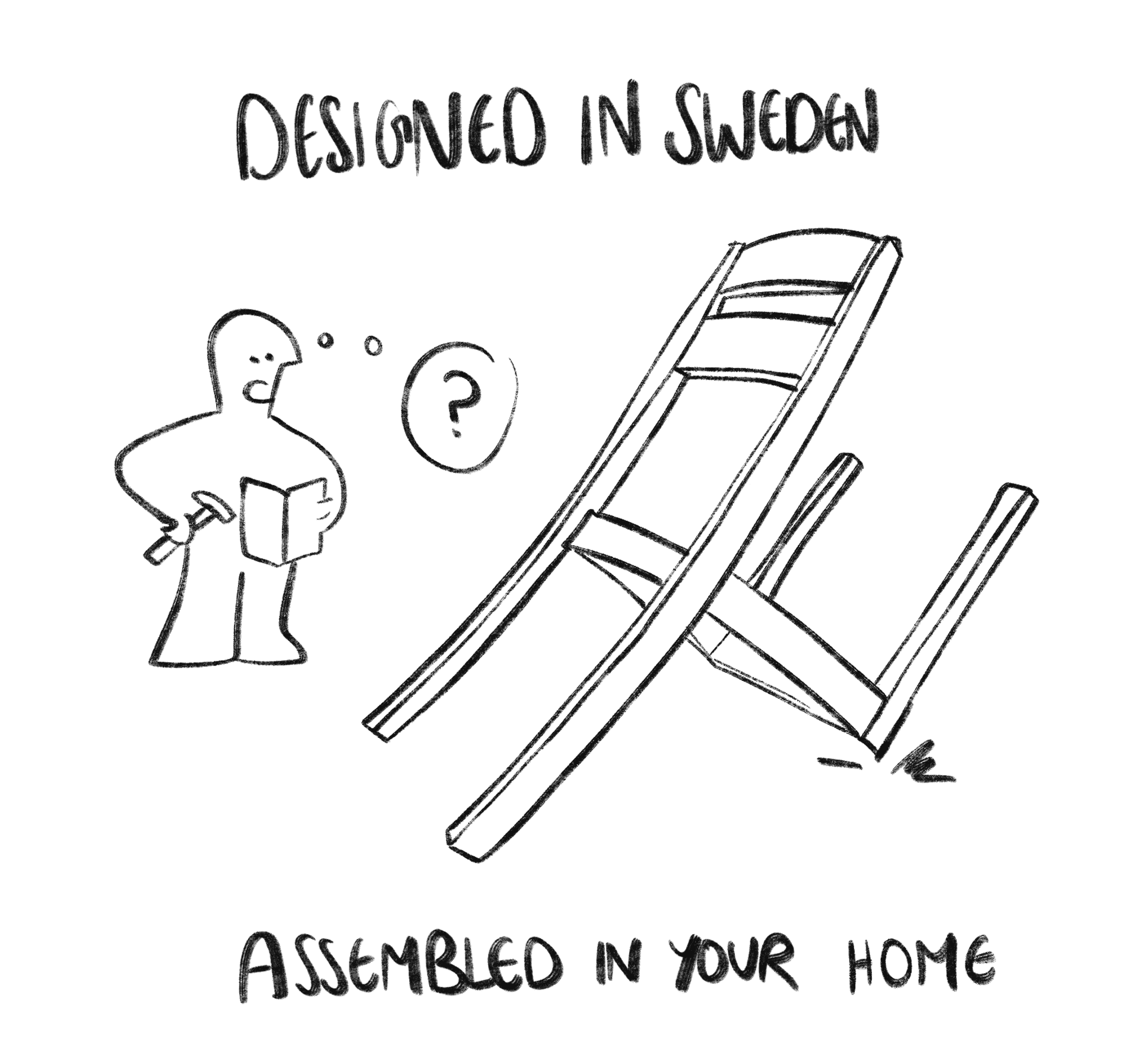
Think about assembling IKEA furniture. The instructions are visual, minimal, and thoughtfully designed—and still, people get it wrong. Not because they’re incapable, but because they skim, assume, or lose focus halfway through.
That’s exactly how people interact with products.
| Mistakes aren’t edge cases. They’re the baseline.
The best products understand this.
Netflix assumes you might not actually be watching. So it asks, “Are you still watching?”
Gmail assumes you might make a mistake. So it gives you Undo Send.
| These aren’t just features—they’re acknowledgments of how people really behave.
The real problem isn’t that users are irrational.
It’s that we design as if they aren’t.
We design for happy paths. For ideal conditions. For a version of the user that is focused, patient, and careful.
| But real users are none of those things—at least not consistently.
The shift, for me, was simple but uncomfortable:
Instead of asking, “Why did the user do this?”
Start asking, “What in the design made this possible?”
Because when someone struggles with a product, they’re not revealing their limitations.
They’re revealing ours.
In the end, the goal isn’t to make users smarter.
It’s to make systems more forgiving.
Because people are not made for products.
| Products are made for people.